
7 bad ideas
creative concept tool
I started this project because I had quite a lot of experience with bad ideas.
7 bad ideas stemmed from several experiences of partnering with businesses that didn’t realize they had a bad business idea. There are a lot of ways to make money in this era, but some ideas aren’t ready for success. This is an app to build a community that keeps us grounded.
Problem
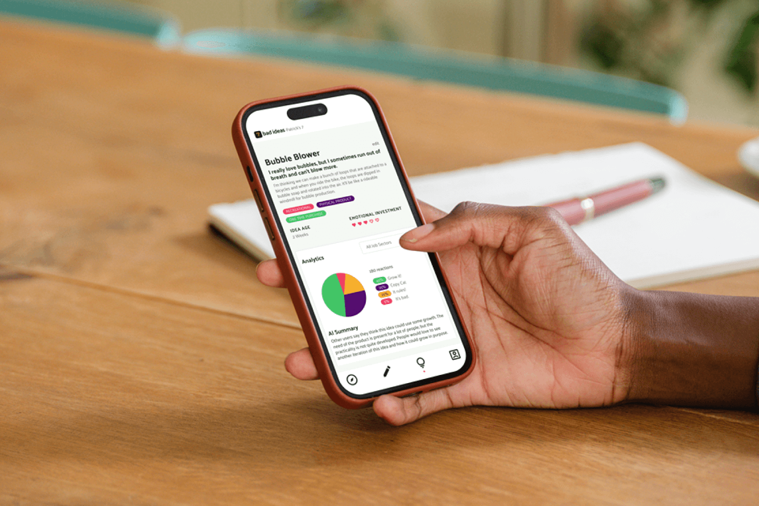
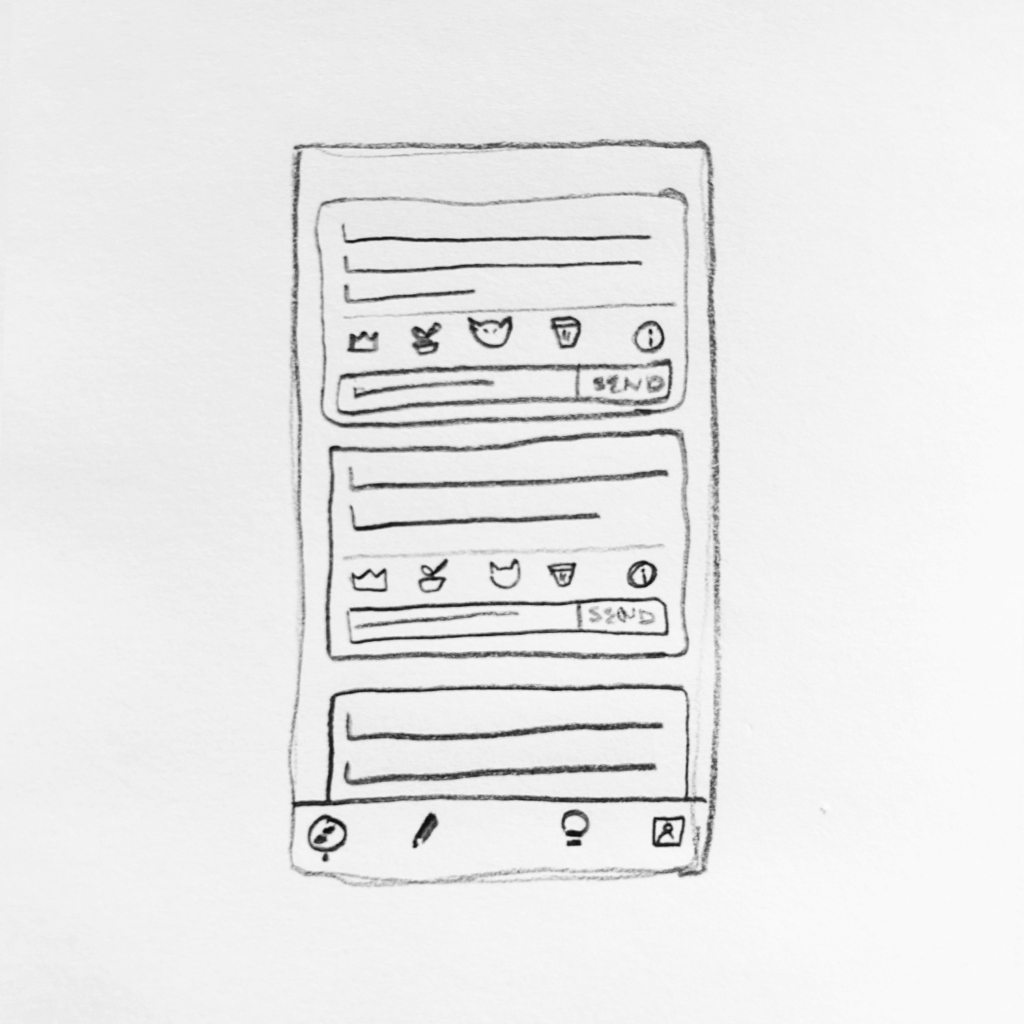
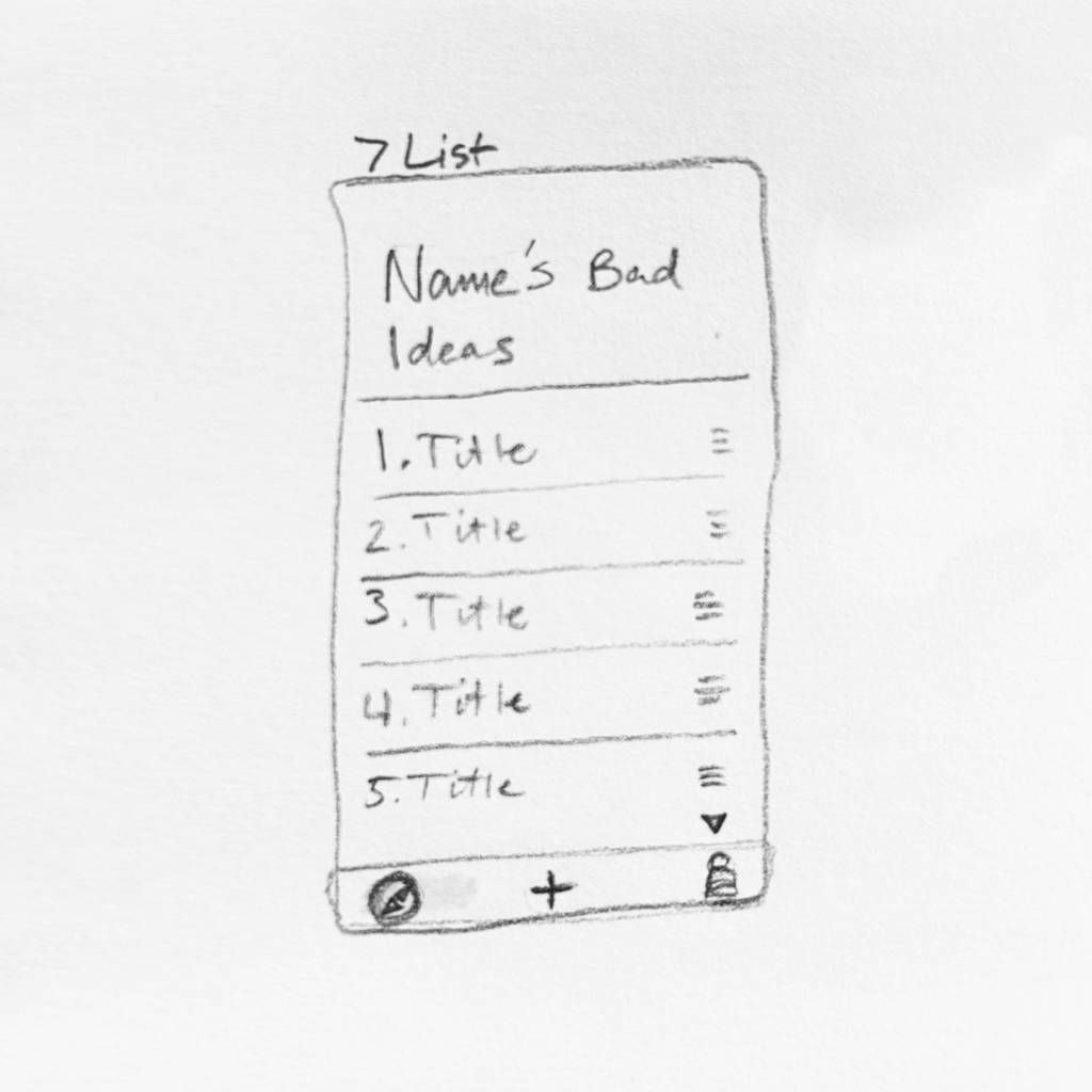
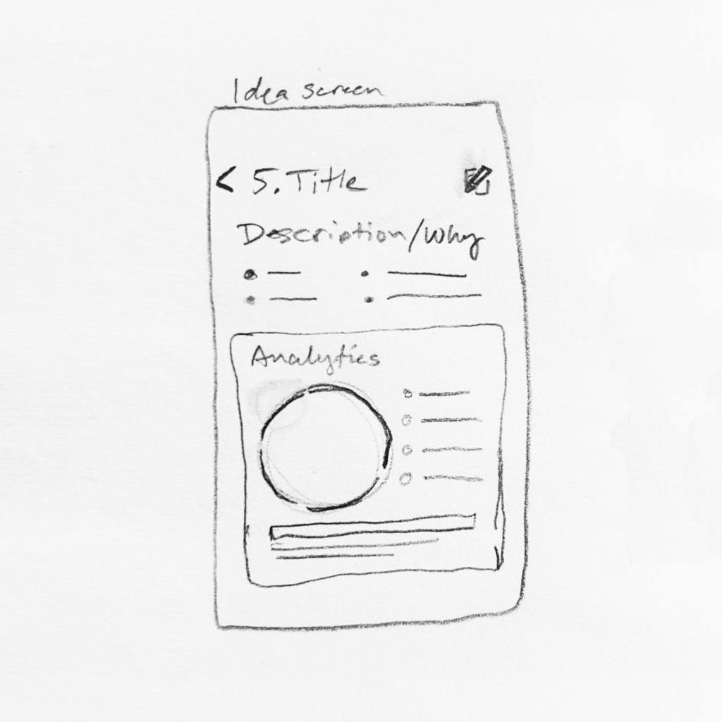
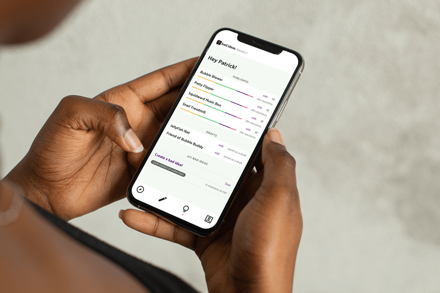
The user would have a lot of needs in this community. There are the individual account needs and the community needs. A user would need to be able to create an idea, save as a work in progress, publish when ready, view all current ideas, view analytics on ideas, etc. The community needs include an idea feed, reactions for feedback, and onboarding opportunities.
Solution
This is a pretty simple system. The user outputs an idea and receives feedback over time, The idea creation needed to foster creativity and help iteration based on feedback. I wanted to set limits for feedback so that it would be constructive and focused on broad parameters.
Goals + Accomplishments
My goals were to design a functional, creative space for users to publish ideas and have analytics from the feedback of the community. Aesthetically, I needed to keep the space clean and organized to be distraction-free to the user. I also wanted to have creative limitations on the quantity of ideas allowed and the type of feedback from the community. The goal for those limitations is to promote self-evaluation from the user and categorize feedback from the community to be constructive and quantitative.
I accomplished an organized workspace by grouping like functions together as well as providing onboarding for new users. I created intuitive icons for navigation as well as leaving feedback. I also made opportunities for reminding users of system language like limitations on creating ideas and leaving feedback.
Overall, the user need was simple. People need a way to write out ideas and receive feedback. I took that and added limitations to force users to commit to 7 ideas and receive specific feedback about those 7 ideas. Adding data points like quantified stats on feedback and AI summaries of written feedback only adds to the value of the community to the feedback system.
Tools 🛠️
Team 🤘🏼
My Role 👾
My Design Process
Design Brief
Since this was a personal project, I was able to have freedom in all aspects. I wanted to be minimal, but creative in my color palette and iconography. The terminology is fun, but understandable. The user flow is straightforward and adoptable for new users.
What is success?
The user needs a simple interface for creating ideas and receiving feedback on their published ideas. If a user wants to give feedback on other’s ideas, they need a simple way to give preset reactions or minimal feedback to submit. A successful experience is one that the user can get feedback on their ideas and if they want give feedback to the community.
Learnings
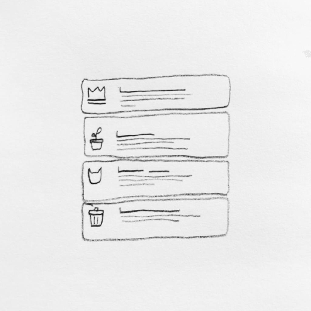
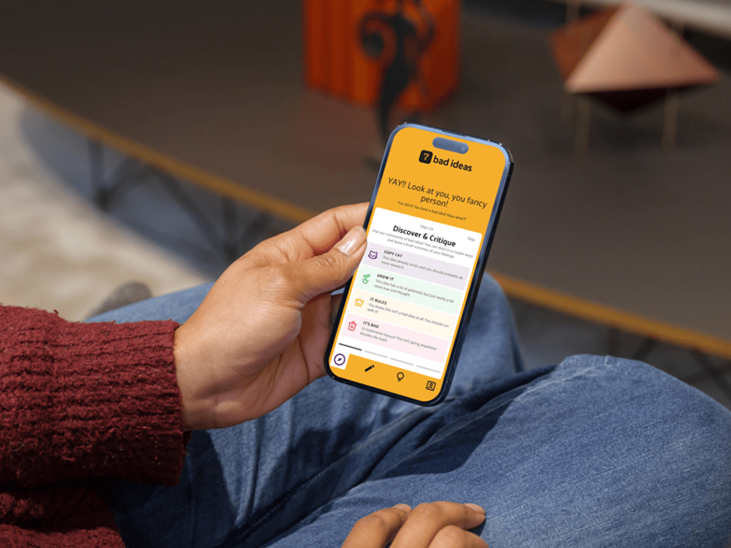
The community and feedback function taught me a lot about maintaining an adoptable experience as well as designing the most relevant content. For instance, I decided to show the problem each idea solves instead of the name of the idea. This give the community a better grasp of the concept than an internal nickname. I also provided a key to explain the feedback methods that is readily available on each community tile. This prevents users from having to memorize the feedback parameters.
There were a lot of minute details that add up in this app to make this a useful tool. Organizing and strategizing at the start were vital to make the experience useful for someone new.
I would want to do more testing specifically on the reactions to find the most intuitive and natural color and icon combos. If the user is confused by the order or idea behind the reactions, that will make the feedback less useful for the community.
Iterating and evaluating with user tests showed me how I can make things clearer and simpler. Grouping items without padding gets rid of clutter. Minimizing statistics in graphic ways helps to reduce busyness.