
clocktower
full design + build
I worked with this client on a problem with their membership and onboarding process.
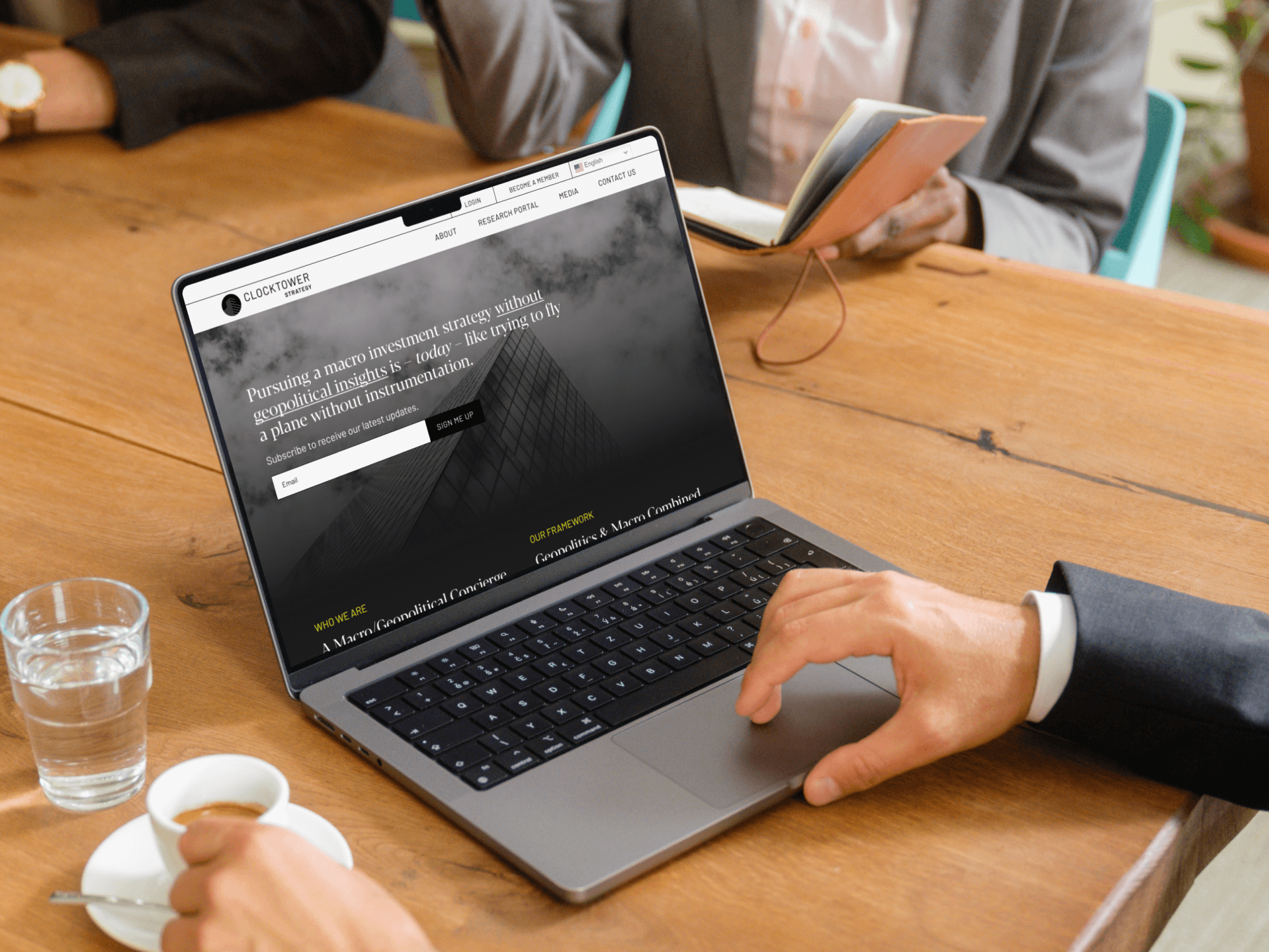
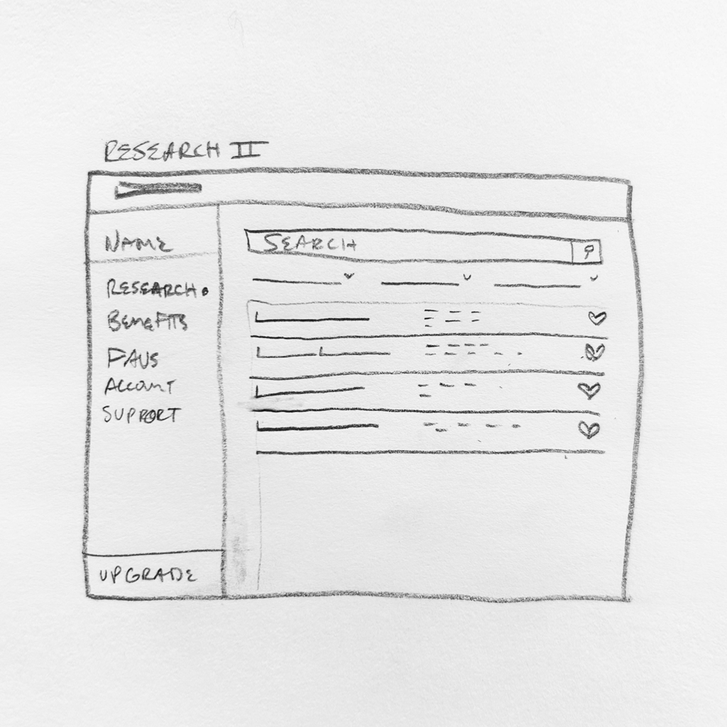
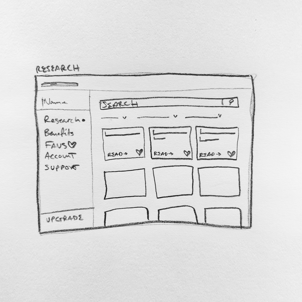
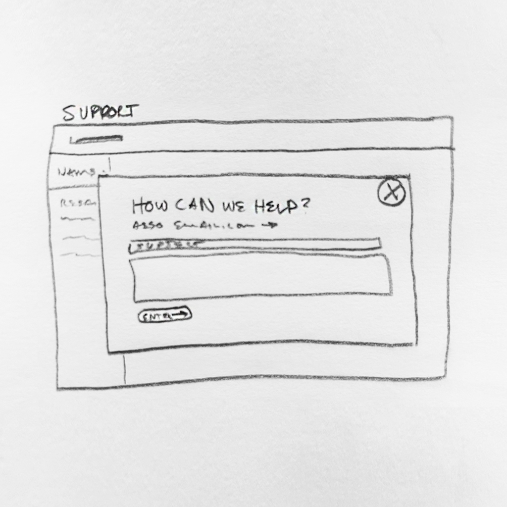
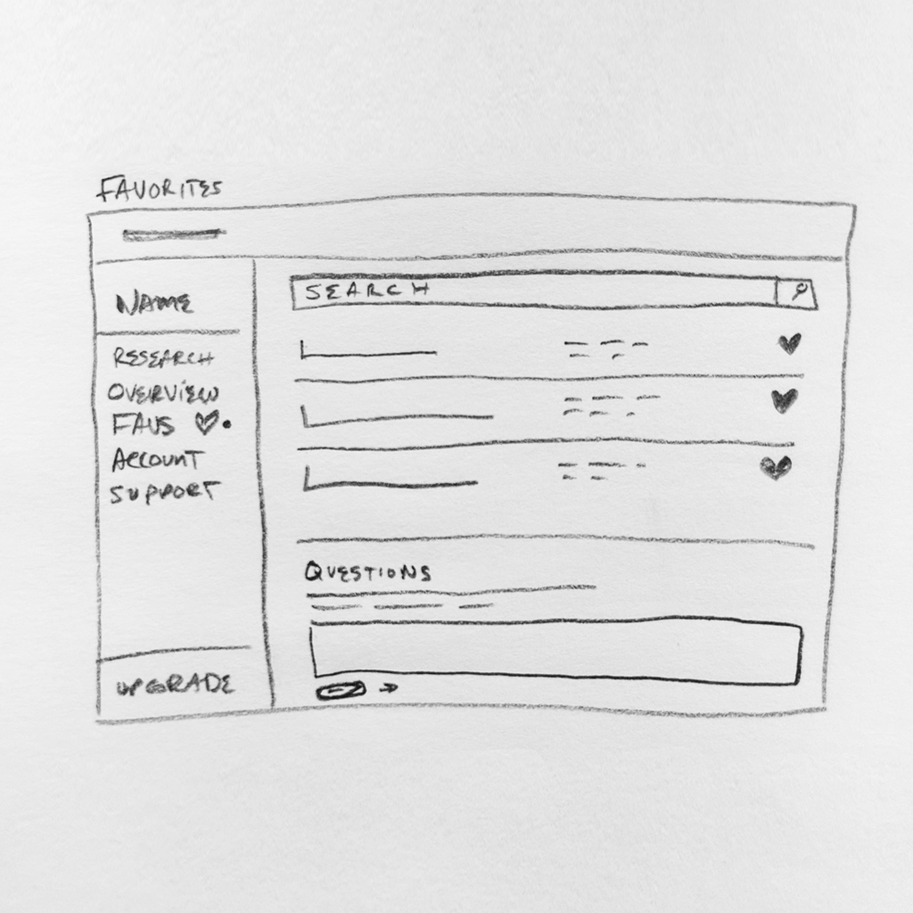
I prototyped and designed a platform for Clocktower to have users see gated content with a create an account prompt. Once a user created an account, they had access to a tiered library of resources with the ability to save favorited articles, subscribe to specific outlets, and search the whole library for desired terms.
Problem
The Clocktower team had a ton of resources, but had no way of monetizing their library or building a recurring audience. Their brand was scattered and was not desirable to their users. They needed help understanding options on how to present their articles clearly to a broad user base.
Solution
I helped them organize their resources into categories and media types. We wanted to make some content available for free so the user could see the focus of the resources. The onboarding needed to be smooth so as to not frustrate or deter the user from completing the process.
Goals + Accomplishments
We started by strategizing how their users view and digest their resources. They have content on a broad spectrum of topics, so dividing articles into categories that would be useful to specific people and demographics was of top priority.
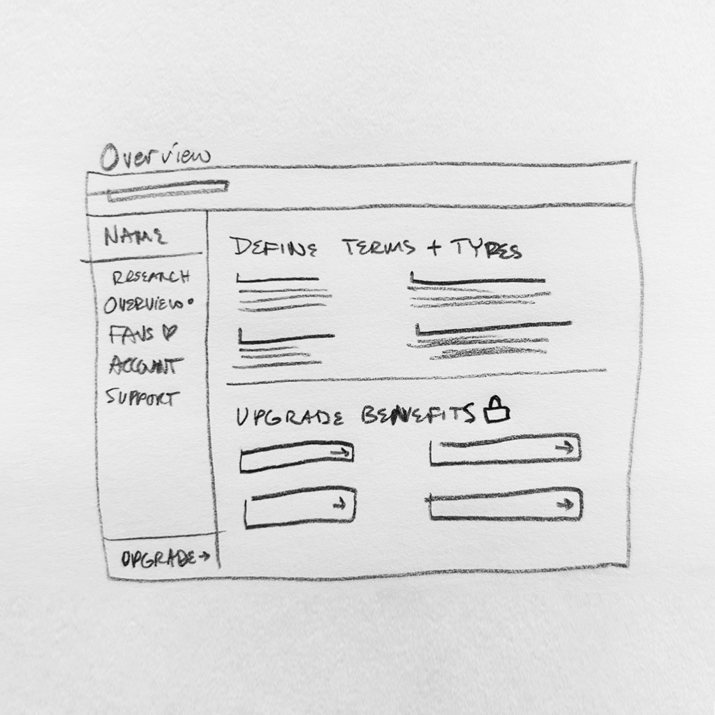
Monetizing their resource library was a large goal of this project, so we made that accessible from several points on each page and within the user dashboard to upgrade their account at any point. We chose to have some resources that were “free” to a minimal account to let the user get a glimpse of the quality and value a paid membership could have.
Onboarding is notorious for being a pain, so we made the account basic without redundant information. We allowed for opt-in to further offers and submitted all user data to the client’s CRM for free content dispersal.
Tools 🛠️
Team 🤘🏼
My Role 👾
My Design Process
Design Brief
I dove into understanding what the client’s business problems were and what solutions they were trying to deliver to their users. They wanted to build a place where their users could come to receive updates and information from them as thought-leaders in the industry. Their users are (in their words) “finance bros” who don’t want to waste time, need favorite content quickly, and want to discover new resources easily.
The brand is minimal and dark with a mysterious vibe. They want to give an elegant and powerful aesthetic while not wasting effort or distracting the user.
Next Steps
My main goal while presenting ideas to the client was communicating the ease of use from a new user standpoint. Onboarding is very important for retaining long-term users. I wanted to ensure the process was adaptable to new people, but also valuable to my client.
We needed to nail down how users would primarily interact with their resources. How would they best sort through the catalog? What were the most important datapoints for the digestion of the content?
Upgrading and maintaining account settings was another large portion of the user’s needs. We worked through basic account functions required to allow their platform to be successful for any user needs present and future.
Learnings
Clocktower was a ton of fun to work with. The dark brand aesthetic was intriguing and the typography was punchy. The most rewarding aspect though was helping the client see how we could achieve their business goals through something as simple as a well-organized resource library.
I saw the value in thinking through all possible outcomes. There were details I had to walk the client through that they had never thought about when it came to building an interface.
Building for commerce is super fun and finding creative ways to show desirability in something “un-sexy” like account settings is very rewarding for the client and the user.
Understand the content, then make suggestions. I had the chance to step back and look at the data to see it in a better way. This allowed me to make better design choices for the user.