
gruffygoat
full rebrand + design + build
As Lead Designer, part of my role is in-house marketing.
I was asked to rebrand, restructure, redesign, and rebuild our studio’s website. This clearly was a lot of work with a fair amount of pressure, but who doesn’t like a challenge? I was given free reign on design direction and was given a blank slate as far as aesthetic.
Problem
GruffyGoat had an outdated design and brand. The site wasn’t high functioning and was clunky on the backend. It was hard to maintain and build for the future.
Solution
I had to dive into who we wanted to be as an studio. What type of projects did we want? Who did we want to work with? Who did we aspire to be like? From there we had a goal that was our direction for all choices.
Goals + Accomplishments
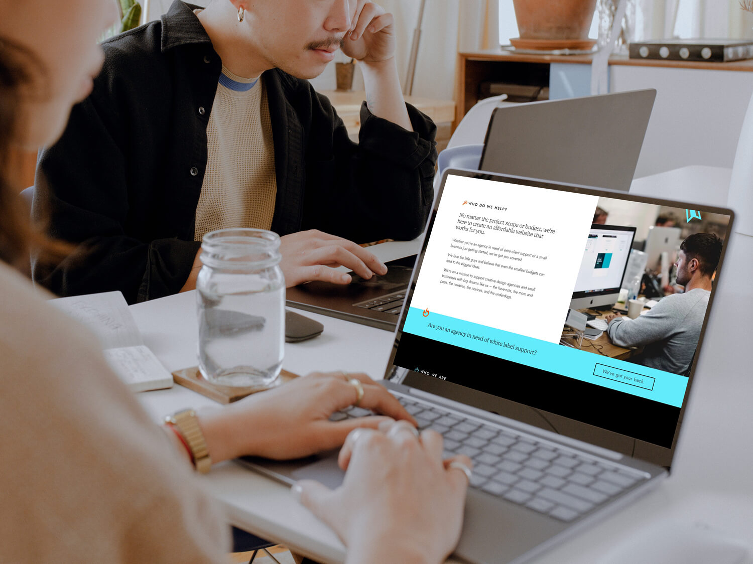
GruffyGoat’s goals were to increase traffic to the contact form for more inquiries on sales. They also wanted a better format for showcasing their successful projects, as well as appeal to a new agency clientele. SEO was a large value to them, so they wanted a lot of content centered around keywords and for the pages to connect in multiple junctures.
The primary user of GruffyGoat is looking to understand the services offered, view previous work, get to know the team, and contact for a quote.
To achieve this, we included paths to the contact page throughout the design, so the user always has somewhere to go. We wrote keyword rich that was conversational and informative for the user. The portfolio of previous projects was reorganized into types of service, types of industry, and categories of project. This way the user can see exactly what they could be working towards. To promote SEO ranking, we included a lot of extra, non-user-specific pages with rewarding content for those users who did some digging. To appeal to agencies, we chose to include minor design and development effects that someone in the industry would appreciate, but wouldn’t be distracting to other users. Including these subtle details was also just a vanity flex, that we can do really cool things just for fun!
Tools 🛠️
Team 🤘🏼
My Role 👾
My Design Process
Design Brief
During the ideation phase of the project, I discussed long-term brand vision with the owners to get an idea of where they wanted to position themselves. We wanted a brand that is memorable, fun, and friendly without looking overdone or mainstream.
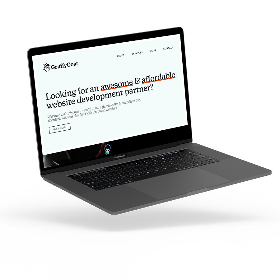
For the website, specifically, we wanted to flex our development chops and highlight what we’re good at. We did this by streamlining our content and making our user objectives clear and achievable.
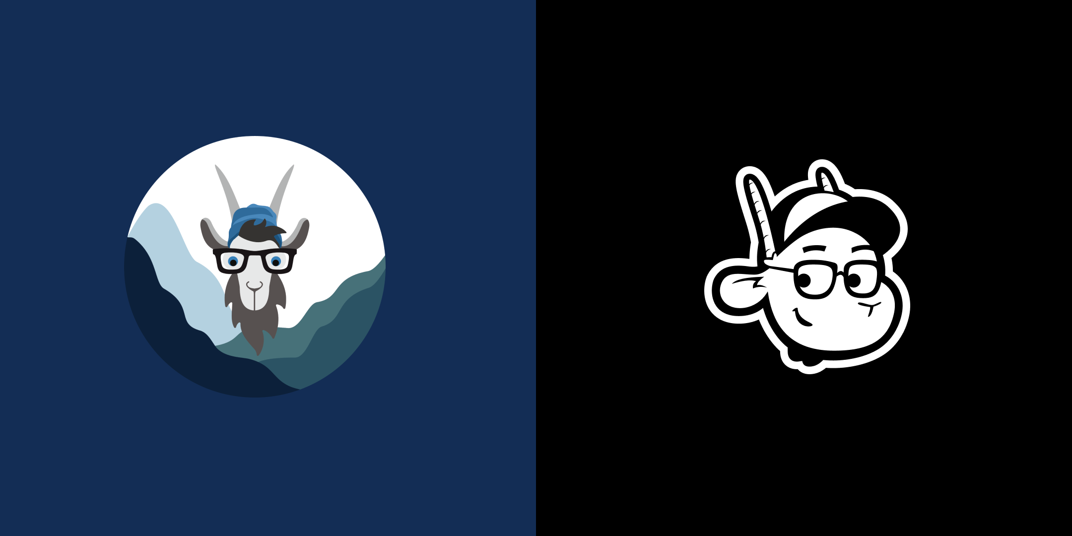
Our brand system was completely starting from scratch, which was definitely a project in itself, but this did allow me to control all of the asset creation and art direction.
What is success?
Our main goal in the rebrand was to attract marketing agencies to partner with GruffyGoat as a white-label development resource. This was accomplished on a couple of different fronts.
First, the user flow directly to our contact form was easily accessible at multiple points on our homepage. We also developed a content-specific page related to this white-label audience, with information and direction for the appropriate actions.
Second, we enriched our overall content to win national ranks for keywords related to “white-label development”. Writing new content and targeting this specific audience has had a direct impact on the quality of leads GruffyGoat has received.
Last, the design aesthetic is simple and clean but geared toward a user that is familiar with web development. It’s hard to cut through the noise of web design, but knowing your strengths and capitalizing on them without “being too much” is essential in this space. We added interactions and details that take skill to create, but don’t distract from the main goal, sales.
Design
We needed a design that was fun, interesting, and professional. On top of all of that, it needed to convert, be sustainable from an asset standpoint, be ADA compliant, and be well thought-out. I started by understanding the priorities, establishing the whole brand system, and building off that.
The finished design is as close to the development as possible. I collected codepens for specific interactions and inspiration. I created the user flow by prototyping for all possible clicks. I developed the hierarchy of pages by emphasizing our desired direction through design cues.
Overall, due to our extensive design thinking process, we completed the design and had a clean handoff to our developer.
Learnings
Throughout this process I was working with my direct bosses. That was an interesting learning curve. I had to communicate the value of design to a sales guy and a support manager. Showing my creative process, why I did what I did, and translating that to how it will profit them was challenging but rewarding. I had to learn how to make them feel heard and how to show them through my work that I empathize with their desires.
I am currently maintaining this project and it has shown me the benefit of not cutting corners. Don’t ever take the hacky way out of a development challenge.
Design on a personal project is hard to complete. I understood the creative 80% rule on a deeper level. If I was looking for perfection, this project would never launch.
The value of strategy and hard conversations was very clear through this project. Always listen to your team and hear what they are saying, even if it means work for you.