inwork
onboarding project creation
I led a team in building a new project onboarding platform for a client.
My client needed to collaborate with potential users through an asynchronous onboarding experience. I worked with them to build a platform for sharing ideas for new projects they would be working on.
Problem
The InWork team needed to be able to accept inspiration and notes from potential clients and repeat users. They needed a way for users to log in and submit feedback on projects they had created and also start a new project.
Solution
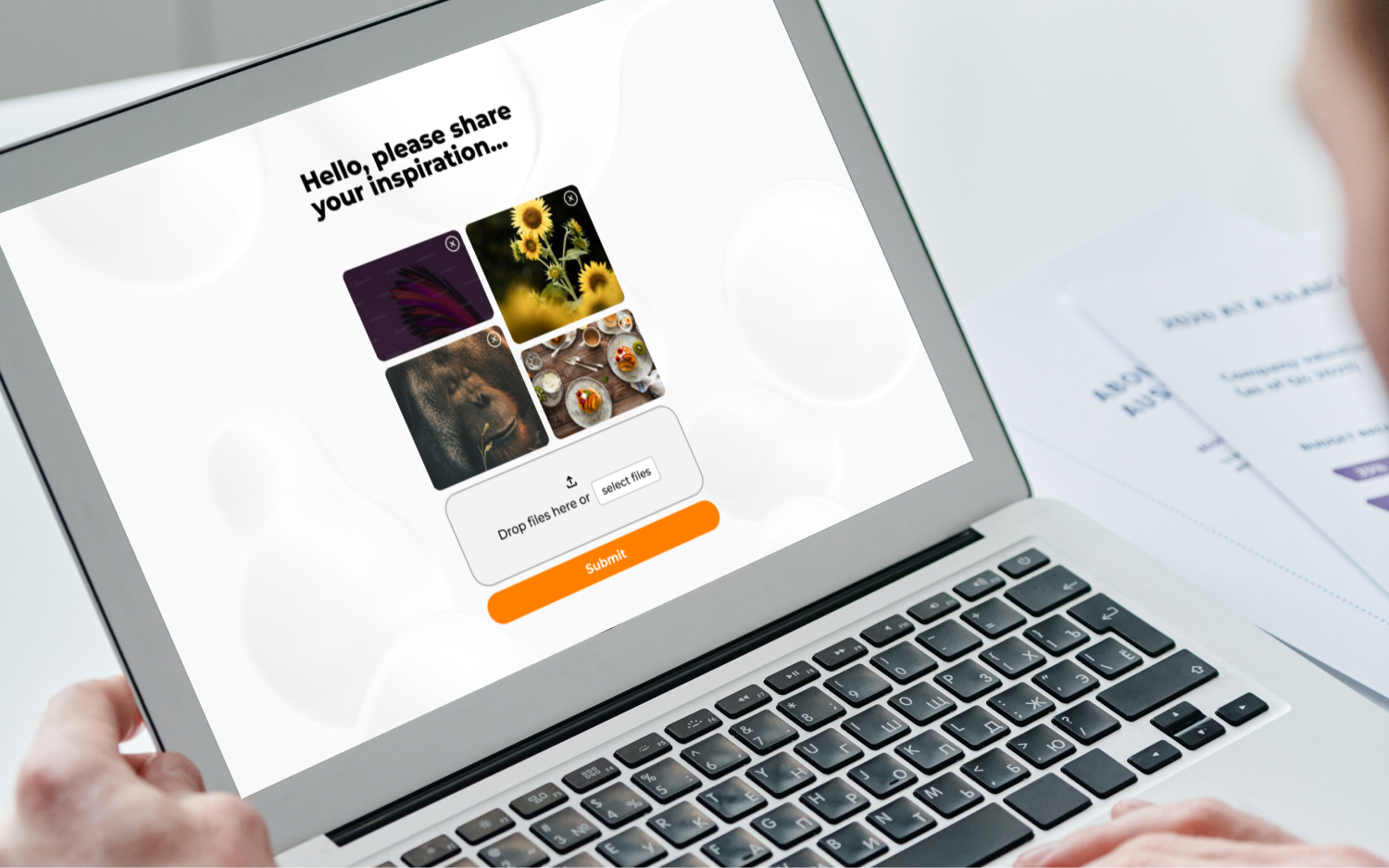
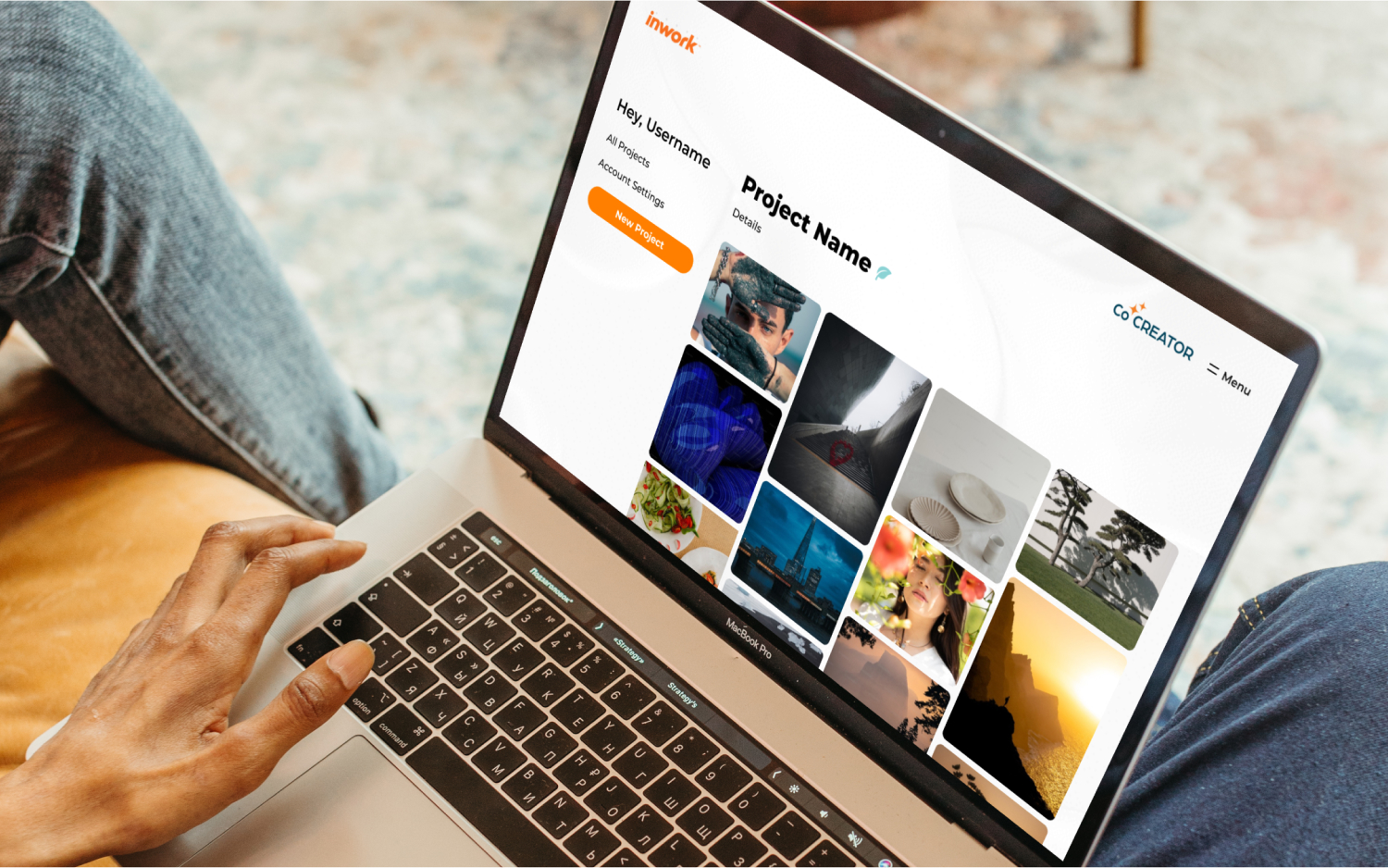
My team built an onboarding form that allowed for a project to be created with inspiration images and descriptions for project needs. We made a portal for users to update, create new, and collaborate with the admin on existing projects.
Goals + Accomplishments
I broke this project into a few parts. First, the onboarding of new users and the creation of new projects. The second was updating existing projects and returning to a user dashboard. Both of these parts coincide at different junctions, but I handled them as separate parts to ensure both types of users had their needs met.
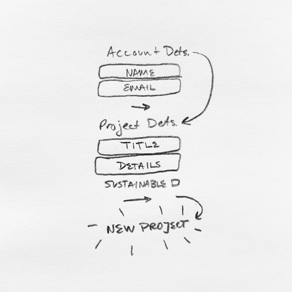
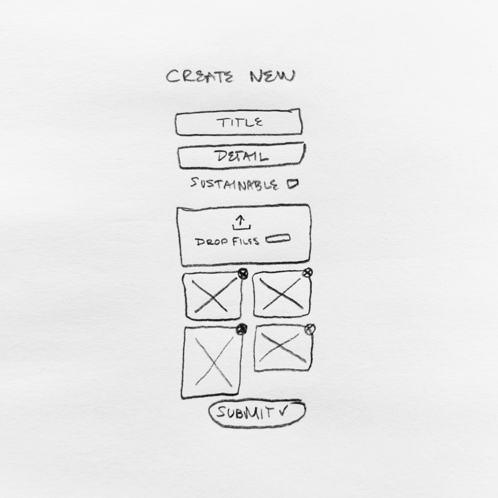
For onboarding and creating, I made this within two flows. A user was able to create an account to submit for verification by the admin. The user would then receive an email verification to confirm the account creation and lead to project creation. This prevented any errors from occurring during account setup. After the account was verified, a user was dropped off at the account dashboard where they were prompted to create a project. Creating a project consisted of the user filling out a form and submitting basic details and images to the project.
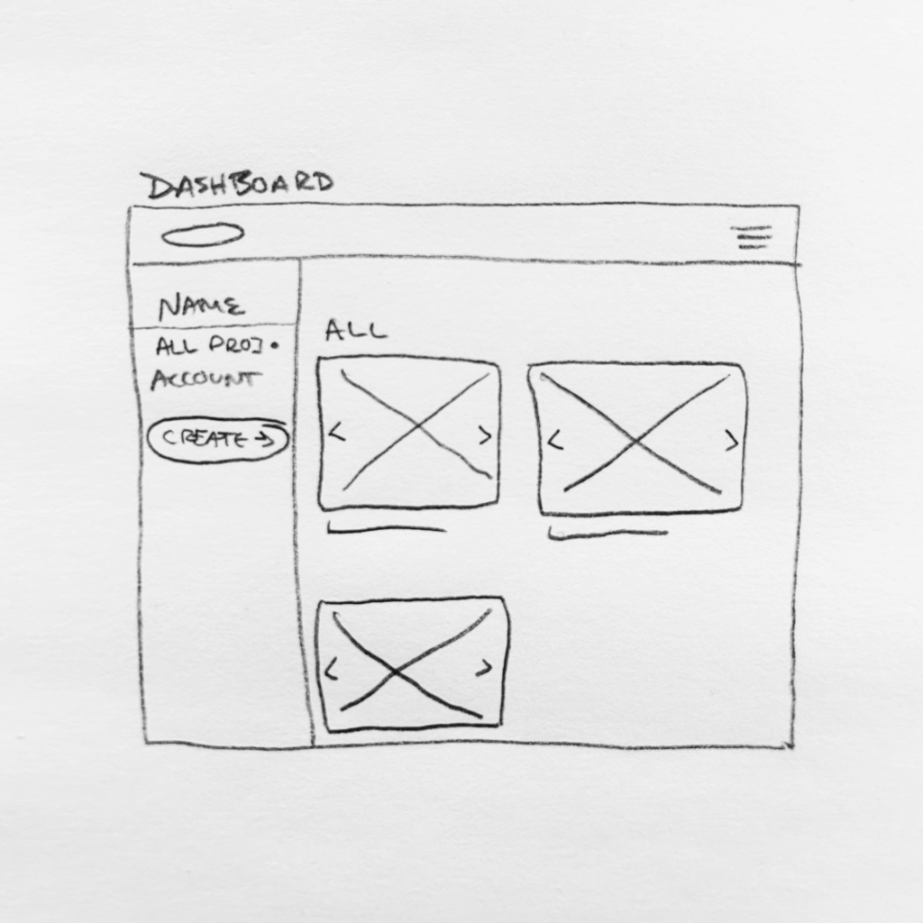
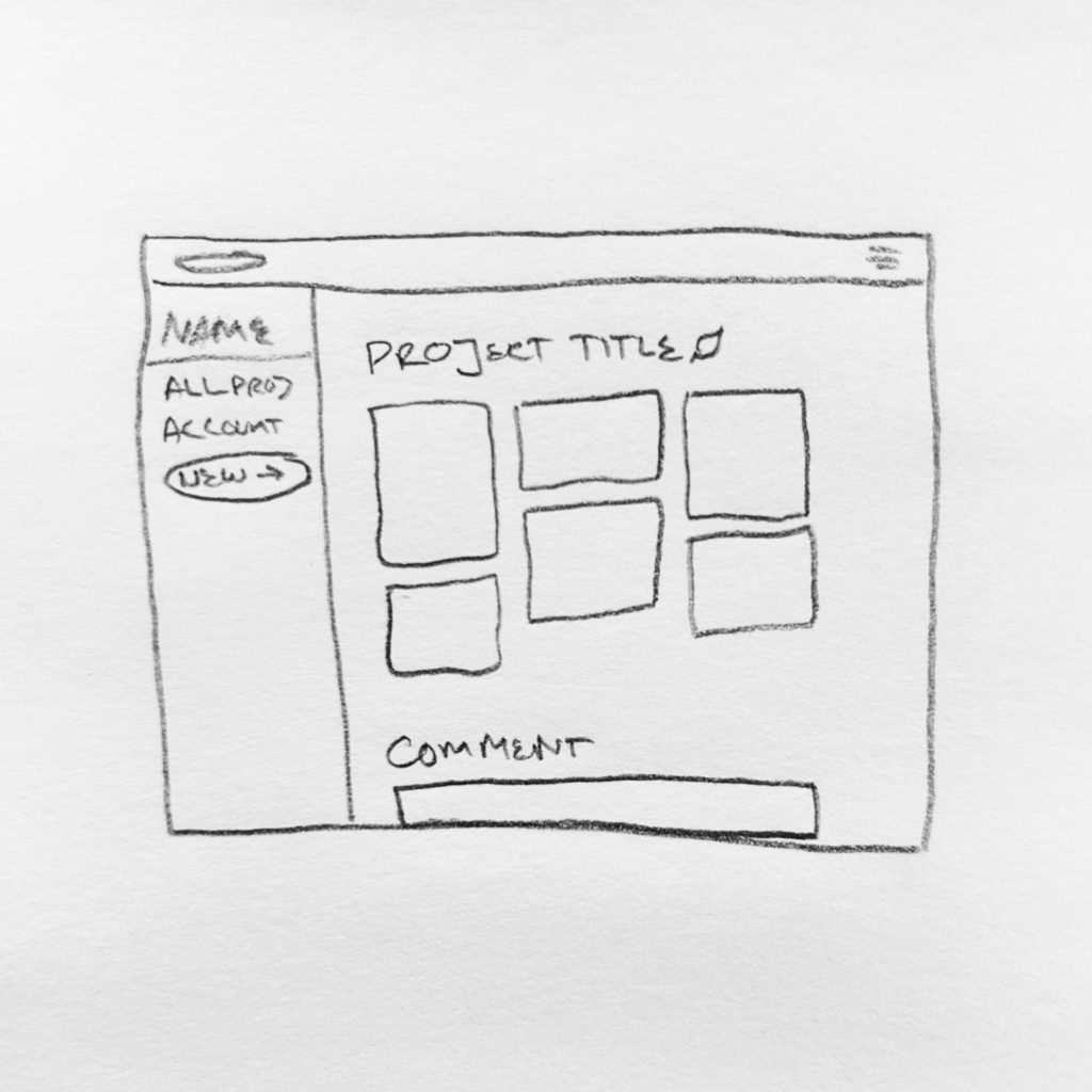
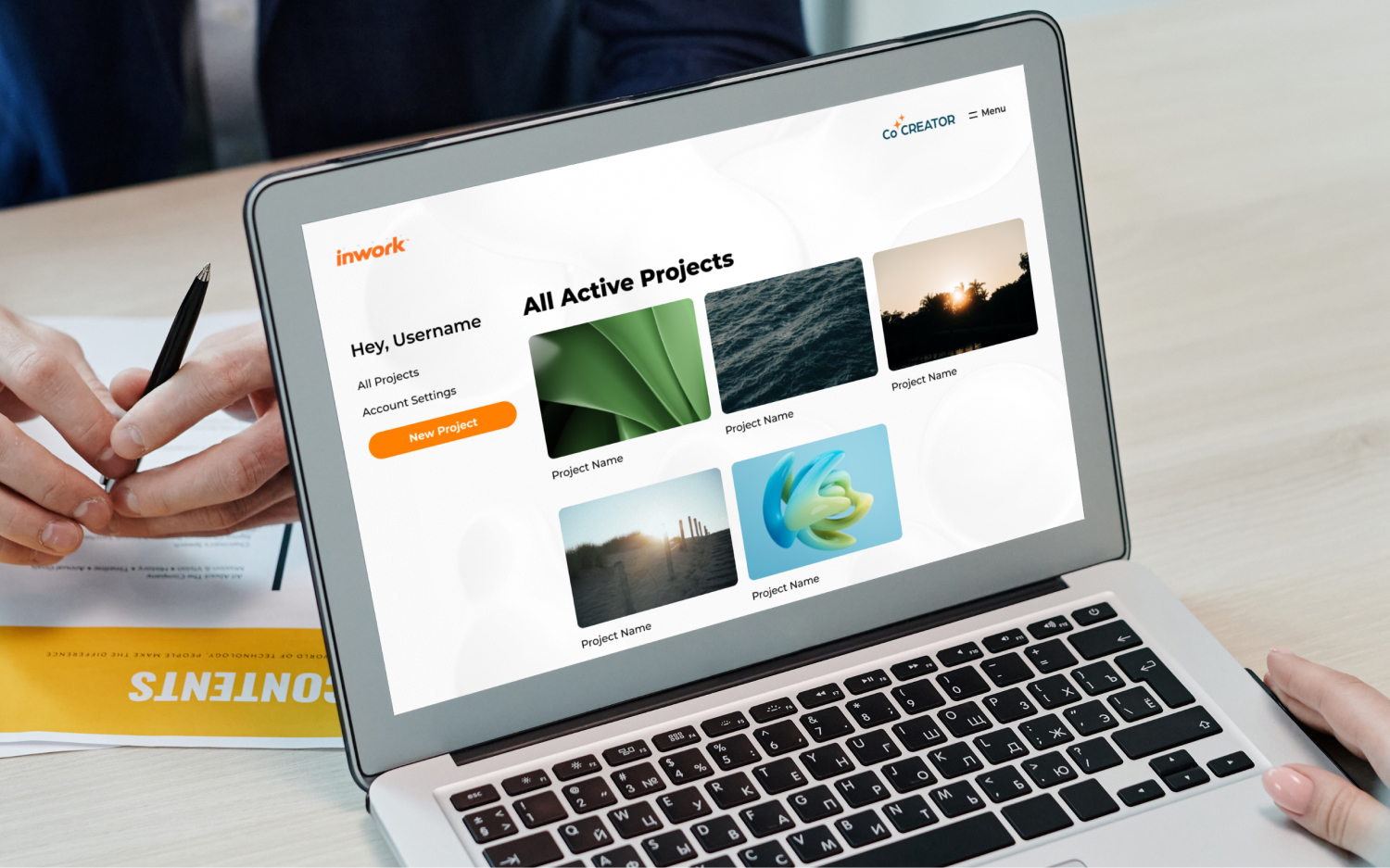
After a project was created the user was then placed back on the dashboard where they were given options to edit account settings, view open projects, or start a new one. The user could leave comments on open projects to collaborate with the site admin.
Tools 🛠️
Team 🤘🏼
My Role 👾
My Design Process
Design Brief
I was working within the client’s brand system, so aesthetics needed to fit in with the rest of their content. The user needed a simple way to communicate their vision for creative projects and a way to collaborate with my client after they had submitted their concepts.
What is success?
My client wanted to improve their project onboarding process. I built a way they could start their creative concepting before their first call with their new contact. This was a way for them to understand the needs of their clients before starting the conversation.
Learnings
I really enjoyed working through this platform’s goals and needs with my team. I learned a lot about error prevention and allowing for user control. I also learned about creating these functions within the limits of WordPress.
The user verification process was something I had to walk through with the client. They wanted a system that would allow immediate creation of projects, but this doesn’t allow for correction when a user mistypes their email or omits important information.
The client really wanted the project creation to be visual. I worked with the dev team to find ways to mimic a masonry gallery during the creation process. This allowed the user to see the progression of what they were submitting.
I made the returning user dashboard as limited as a possible. The user was only able to view and submit comments on live projects. This was because the client budget limited the function and also the client wanted collaboration off platform mainly.

