
only skin
landing page design
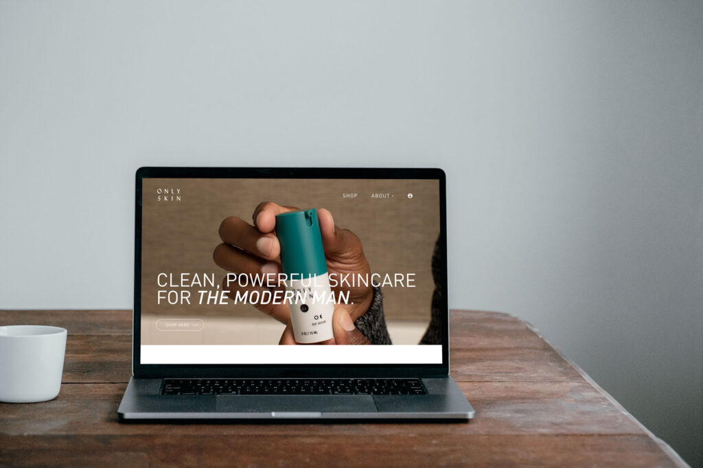
I had the opportunity to work briefly with Only Skin on a homepage redesign.
We had a couple of meetings with their stakeholders to establish the goals of the work. The top priorities were new product kits and a la carte options. The target users are young professional men looking for basic skincare.
Problem
The product options and the shop we not easily accessible or highlighted on the landing page. User flow and info hierarchy had not been discussed until this project, so the site was not converting well.
Solution
Our team restructured the order of the page and offered some UI updates. We created a structure allowing users to find the products immediately and understand the benefits.
Goals + Accomplishments
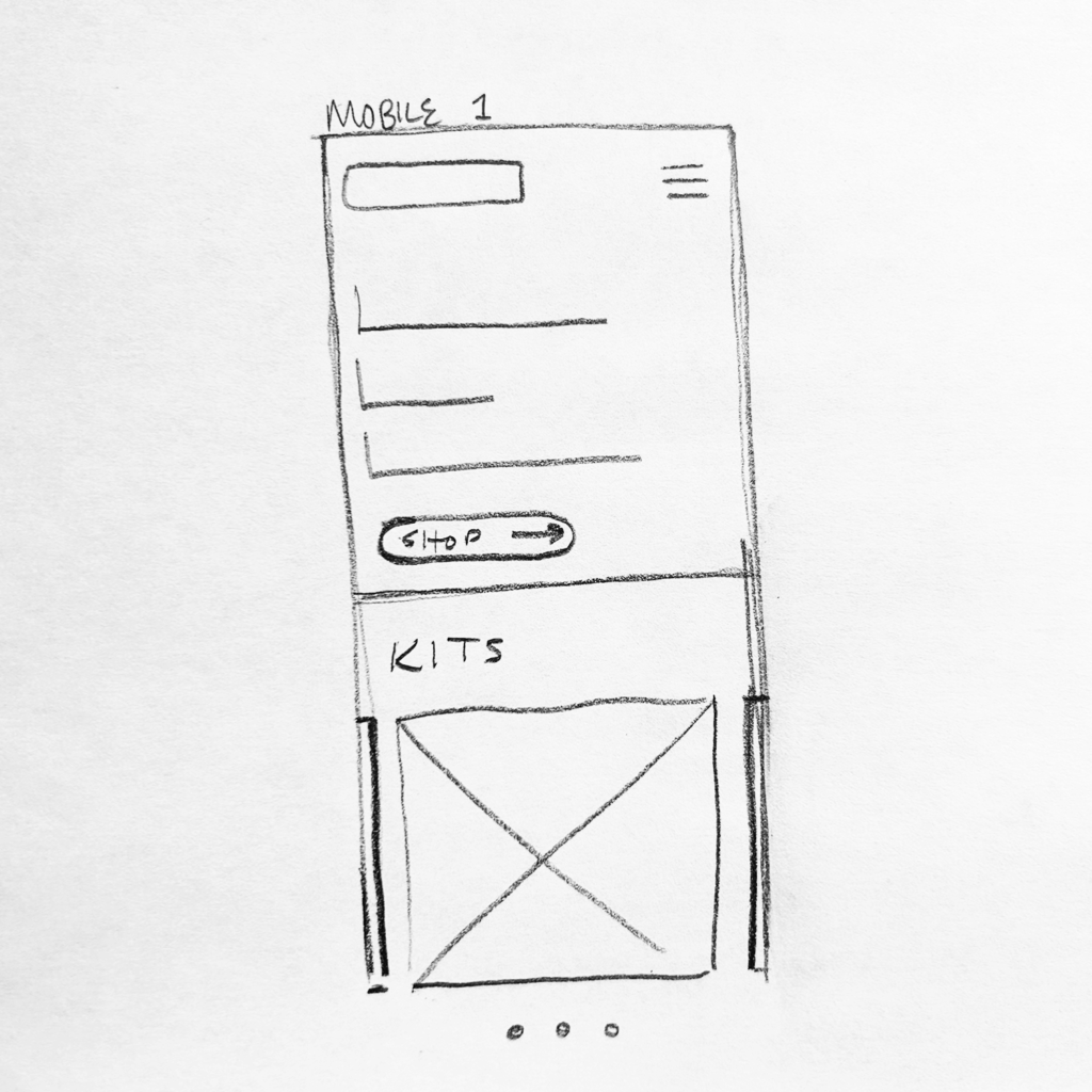
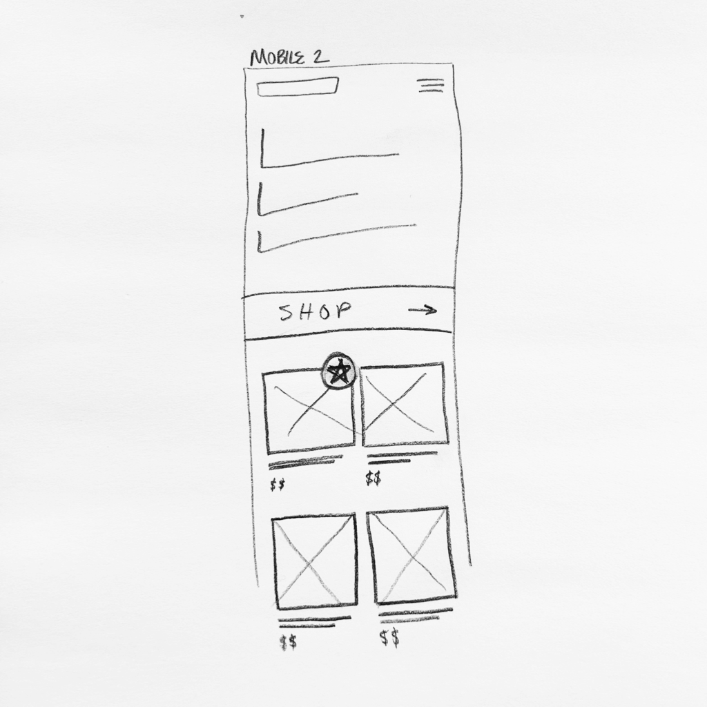
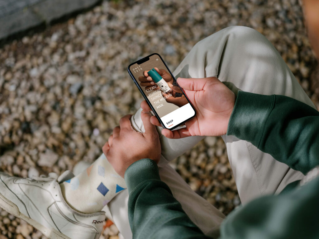
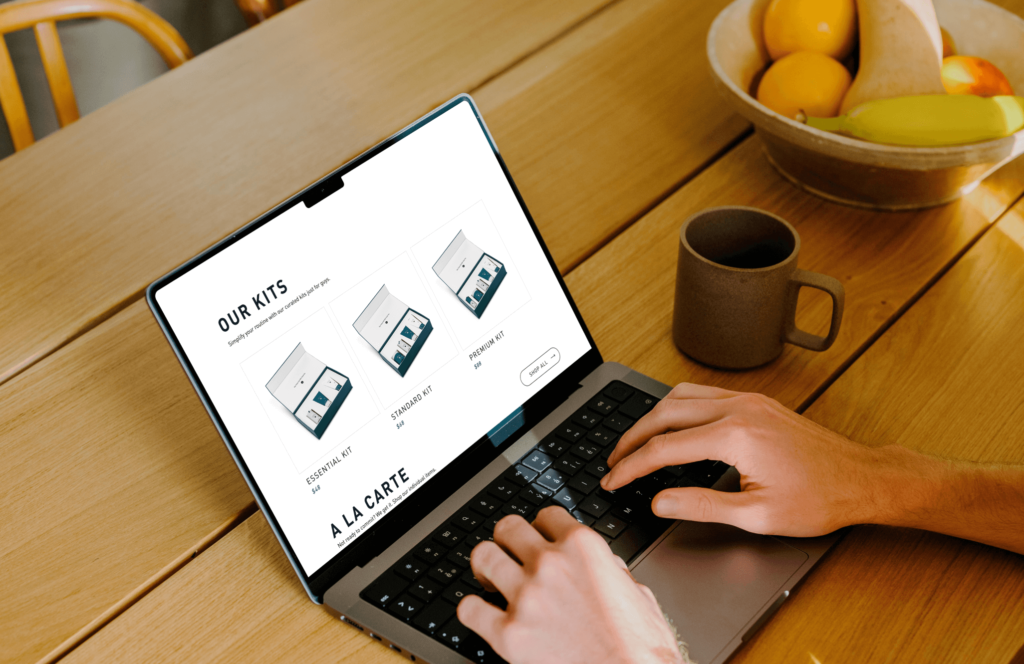
Only Skin needed to promote its different product offerings, both their a la carte and bundled products. These offerings needed to be more accessible from the homepage. Only Skin also runs social campaigns, so mobile performance was very important to capitalize on.
The user of this site needs to understand the benefits of this product and what separates it from other skincare routines. Users will be navigating to the product that best fits their needs and then directly to the checkout process.
Showing the product in the first look was crucial to provide context and action. We increased the visibility of the product offerings on the homepage and allowed users to speed through to the checkout process. Organizing the product into bundles and a la carte helps the user find something more suited to their needs at the time. For both mobile and desktop, we minimized the clicks needed to complete a purchase to make the experience as streamlined and efficient as possible.
Tools 🛠️
Team 🤘🏼
My Role 👾
My Design Process
Design Brief
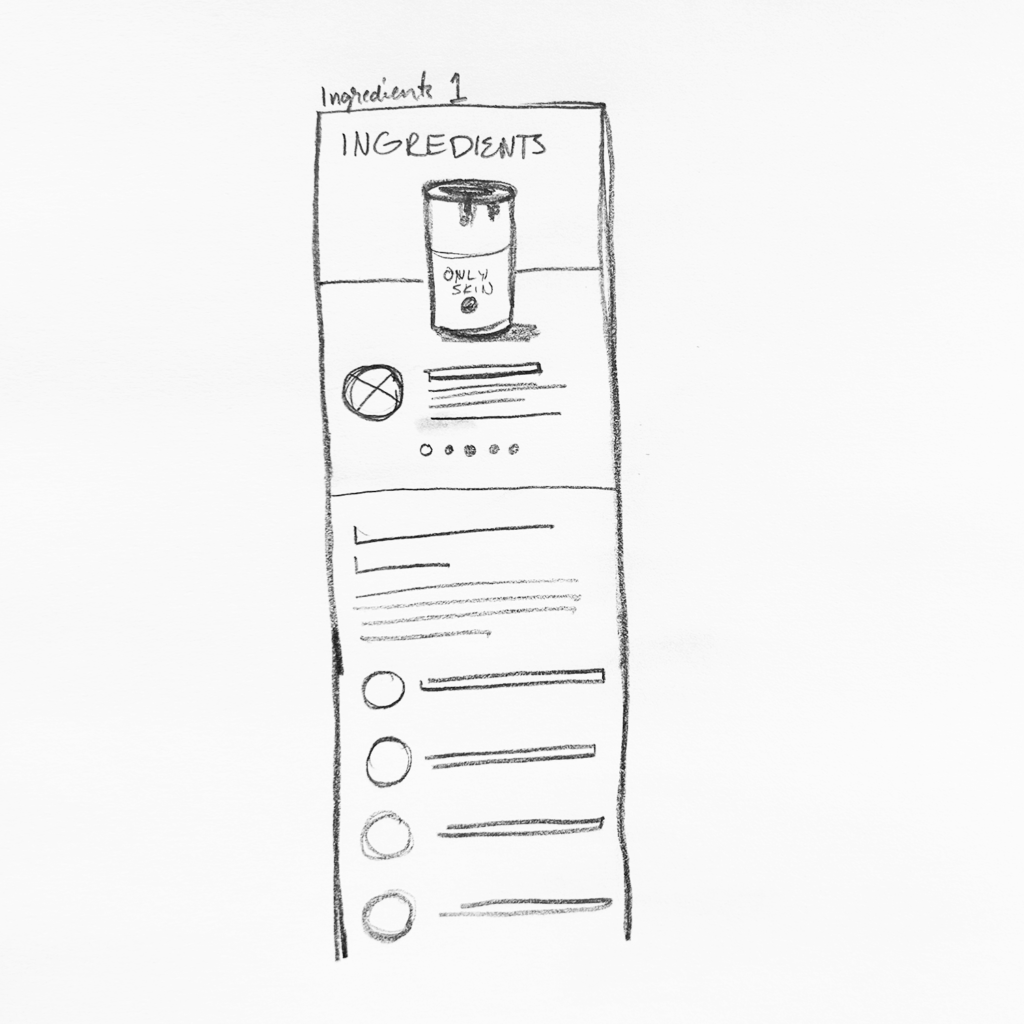
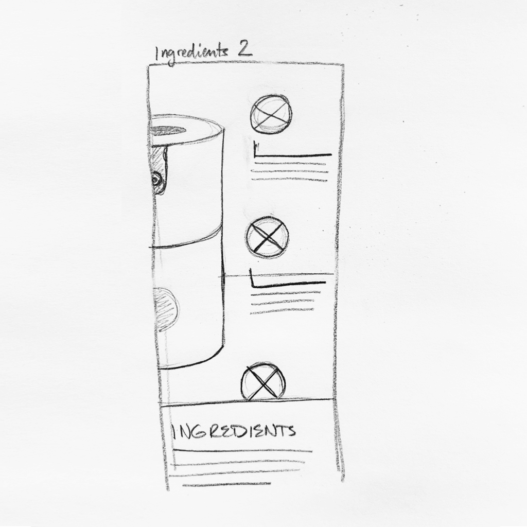
Since I was personally in the target demographic, I was really excited about the possibilities with this project. I knew the client ran social ads, so I would have to nail down the mobile experience for those users. I also wanted to display the ingredients information in a visually intriguing way while making it interactive and unique.
What is success?
Our main goal was to introduce a better user flow to the homepage in order to increase sales. We did that! The skincare packages had increased visibility and the client saw the benefit of the organization and design updates.

Learnings
The project was a lot of fun. The client assets we great, the content was pretty well put together, and the organization was a game-changer for them. It makes such a difference when you plan and talk through all aspects of the project and what success is for the client.
Assets mean so much to the quality of the product. I have rarely worked on a project with assets to this caliber, and it made my job so much easier.
Always know the goal. Understand where you have been and where you are headed. This will determine how to get there and what steps are for the present.
The whole picture of their marketing strategy was vital. Knowing when they would push certain events and sales played a large part in this overall project.